
PxPlus Releases
|
PxPlus 2025 (version 22.00) |
May 2025 |
PxPlus 2025 includes new features for added security and introduces feature-rich enhancements to bring enhanced performance and flexibility to your applications:
|
|
Keeping up-to-date with the latest security protocols is crucial for protecting sensitive data and systems from evolving cyber threats. Outdated security measures can leave vulnerabilities that are easily exploited. PxPlus 2025 features the latest security modules, safeguarding your application and your customers' data. |
|
|
Email providers have strengthened email security by replacing basic authentication with OAuth2 to reduce credential theft and unauthorized access. PxPlus 2025 now supports OAuth2 authorization in SMTP and Web Email utilities. |
|
|
.NET offers a wealth of robust libraries. The new .NET Interface for PxPlus 2025 redefines what is possible with PxPlus, forging a powerful bridge to the .NET ecosystem and paving the way for the next generation of intelligent, adaptive applications. |
|
|
JSON is a widely adopted standard for representing structured data and facilitating data interchange across systems. The new JSON object in PxPlus 2025 is extremely fast and introduces a richer set of features and methods, greatly simplifying the creation and manipulation of JSON data while significantly improving current JSON functionality. |
Major New Features
- Updated PxPlus Security modules:
- OpenSSL 3.5.0
- Curl 8.13.0
- Plink 0.83
- Updated CA Root Certificates
- Updated the version of Chromium (*Browser)
- Updated
PxPlus SQL ODBC Driver and
PxPlus SQL Server (Version 8.10.0000) to use the latest OpenSSL 3.5.0
- Added support for
OAuth2 authorization to the
SMTP and
Web Email utilities to enforce stricter security
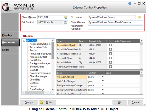
- New .NET Interface facilitates the seamless integration of .NET objects into applications, ensuring the same level of usability and consistency as native PxPlus objects
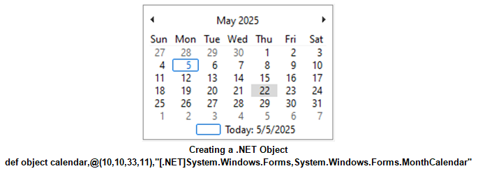
- New .NET External Controls for embedding .NET objects into NOMADS panels
- How to Create a .NET Button (NOMADS)
- How to Create a .NET Calendar Control (NOMADS)
-
How to Display a Date in a PxPlus Multi-Line from a NOMADS .NET Calendar
- New JSON Object interface
- Enhanced capability to convert JSON to XML and XML to JSON using updated objects
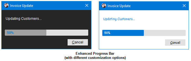
- Visually enhanced Progress Bar with customizable styling options
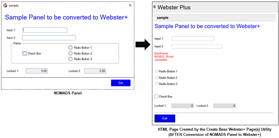
- As part of our ongoing commitment to expand Web development activities, a new
Create Base Webster+ Page(s) utility has been introduced to create base Webster+ HTML pages from NOMADS panels as a starting point
- In keeping with our continued focus to modernize the PxPlus toolkit and your applications for both NOMADS and non-NOMADS, new control properties have been added for enhancing the user experience

- We updated the PxPlus Visual Studio Code Extension (Version 1.0.1) to support running on UNIX/Linux platforms
- WindX performance improvements
Enhancements
Language Changes
- Updated the PxPlus build environment to the latest version (Visual Studio 2022) to take advantage of the latest compiler optimizations
Directives
- Enhanced the DUMP DISABLE directive to accept a pattern string, providing greater control of the variables that can be excluded from the dump
- .NET support added to the DEF OBJECT directive
- Added the ability to pass Arguments to the DEF OBJECT directive for .NET objects
- .NET support added to the ON EVENT directive
Properties
Properties can be used to specify settings for NOMADS and non-NOMADS applications.
Note: To use the new properties, 4D mode is required.
- Check Box properties added
- CbDisableFrameColor$: Sets the color of the disabled Check Box frame only for standard Check Boxes (with no bitmap added)
-
CbDisableMarkColor$: Sets the color of the check mark or X in the disabled Check Box only for standard Check Boxes (with no bitmap added)
- Grid properties added
- CbMarkColor$: Sets the color of the check mark or X in the Check Box
- HdrLineColor$: Sets the color of the border lines drawn between columns when the 'ExcelStyle property is set for the top row only of the Grid (does not affect the leading left column)
- LockButtonColor$: Sets the background color for locked system-generated buttons in a Grid, including Drop Box buttons and Query buttons
- LockForegroundButtonColor$: Sets the foreground text color for locked system-generated buttons in a Grid, including Drop Box buttons and Query buttons
-
RowHeaderLineColor$: Sets the color of the border lines drawn between rows when the 'ExcelStyle property is set for the leading left column only of the Grid (does not affect the top row)
- Radio Button properties added
- RbDisableFrameColor$: Sets the color of the disabled Radio Button frame only for standard Radio Buttons (with no bitmap added)
-
RbDisableMarkColor$: Sets the color of the circle in the disabled Radio Button only for standard Radio Buttons (with no bitmap added)
- Existing properties enhanced to support additional controls
- ActiveBackColor$: Can now be used for standard Check Boxes and Radio Buttons (with no bitmap added)
- DisableBackColor$: Can now be used for disabled standard Check Boxes and Radio Buttons (with no bitmap added)
- HoverBackColor$, HoverBorderColor$, HoverTextColor$: These properties can now be used for standard Check Boxes and Radio Buttons (with no bitmap added), Drop Boxes, Variable Drop Boxes, Multi-Lines and RTF Multi-Lines
Objects
- Array List Object now supports the ability to append and insert an array list to another array list
- Added Microsoft Service type to the OAuth2 object
JSON and XML Objects
- New JSON Object provides a faster, more structured and efficient way to handle JSON data than associative arrays, offering a richer set of functions and methods for manipulating JSON structures
- New methods added to XML Object
- Load_json: Sets the XML object using a JSON object
- Load_xml_file: Loads the XML object from the data in the given XML file
- Save_xml_file: Saves the XML data from the object to a file
Excel and Word Objects
- Ability to instantiate the Excel Object or Word Object by passing a [RUNNING] or [RUNNING OR NEW] parameter
- New methods added to Excel Object
- AutoFitAll: Sets the AutoFit property for all columns and rows in a worksheet
- AutoFitColumns: Sets the AutoFit property for the columns for a range of cells in a given worksheet
- AutoFitRows: Sets the AutoFit property for the rows in a range of cells in a given worksheet
- New methods added to Google Sheets Object
- AutoFitAll: Auto resizes all column widths and row heights based on cell content in a sheet
- AutoFitColumns: Auto resizes column widths based on cell content for a range of cells in a given sheet
- AutoFitRows: Auto resizes row heights based on cell content for a range of cells in a given sheet
Webster+
- Added the Create Base Webster+ Page(s) utility for creating base HTML pages from existing NOMADS panels as a starting point
- Improvements to iNomads template used when displaying iNomads tasks in Webster+
Visual Studio Code Extension
- Updated to use Version 1.0.1 to support running on UNIX/Linux platforms
Enhanced IDE, NOMADS and Toolkit
- Updated fonts and properties for Dark and Light mode toolkit themes
- Added new Tab Name options to the Tab Name drop box on the Maintain IDE HTML Tabs dialog
- New Projects menu available with options for creating/editing projects and managing project tasks when NOMADS is run from the PxPlus Command Line (using the Nom command), similar to the PxPlus IDE
- NOMADS+ Toolbar is now the default panel designer
- Grid Presets: New properties added
- CbMarkColor$: Sets the color of the check mark or X in the check box
- HdrLineColor$: Sets the color of the border lines drawn between columns when the 'ExcelStyle property is set for the top row only of the grid and does not affect the leading left column
- LockButtonColor$: Sets the background color for locked system-generated buttons in a grid, including drop box buttons and query buttons
- LockForegroundButtonColor$: Sets the foreground text color for locked system-generated buttons in a grid, including drop box buttons and query buttons
- RowHeaderLineColor$: Sets the color of the border lines drawn between rows when the 'ExcelStyle property is set for the leading left column only of the grid and does not affect the grid top row
- Change Directory utility (in NOMADS Session Manager) now has a query button in the Directory field for selecting a directory or creating a new one
- Updated the panel header and controls information that can be displayed when using the PxPlus Wiki
- Renamed COM control in all screen designers to EXT External Control
- .NET objects can now be added to a NOMADS panel using External Controls in all screen designers
File Maintenance Generator
- Ability to create or edit the Interface Program and Grid Initialization Program by using the program editor when generating file maintenance HTML pages
- Adding a Folder Location now automatically defaults to a Full row
iNomads
- Added support for the Multi-Line Encrypt$ property
Themes and Visual Classes
- New check box option added to
Font Properties allows a specified font name to be used without overriding the font size and attribute settings for the library, panel or individual controls
- Check Box properties added or modified
- CB Disable Frame Color added: Sets the color of the disabled Check Box frame only for standard Check Boxes (with no bitmap added)
- CB Disable Mark Color added: Sets the color of the check mark in the disabled Check Box only for standard Check Boxes (with no bitmap added)
- Hover Background Color, Hover Border Color and Hover Text Color: These properties can now be used for standard Check Boxes (with no bitmap added)
- Check Box Frame Color renamed to CB Frame Color
- Check Box Hover Color renamed to CB Hover Color
- Check Box Mark Color renamed to
CB Mark Color
- Drop Box properties added
- Hover Background Color: Sets the background color when the mouse is over the control
- Hover Border Color: Sets the border color when the mouse is over the control
-
Hover Text Color: Sets the foreground text color when the mouse is over the control
- Grid properties added
- CB Disable Mark Color: Sets the color of the check mark in the disabled Check Box
- CB Mark Color: Sets the color of the check mark in the Check Box
- Header Line Color: Sets the color of the border lines drawn between columns for the top row only of the Grid and does not affect the leading left column
- Lock Button Color: Sets the background color for locked system-generated buttons in a Grid
- Lock Foreground Button Color: Sets the foreground text color for locked system-generated buttons in a Grid
-
Row Header Line Color: Sets the color of the border lines drawn between rows for the leading left column only of the Grid and does not affect the top row
- Multi-Line properties added
- Hover Background Color: Sets the background color when the mouse is over the control
- Hover Border Color: Sets the border color when the mouse is over the control
-
Hover Text Color: Sets the foreground text color when the mouse is over the control
- Radio Button properties added or modified
- RB Disable Frame Color added: Sets the color of the disabled Radio Button frame only for standard Radio Buttons (with no bitmap added)
- RB Disable Mark Color added: Sets the color of the circle in the disabled Radio Button only for standard Radio Buttons (with no bitmap added)
- Hover Background Color and Hover Border Color: These properties can now be used for standard Radio Buttons (with no bitmap added)
- Radio Button Frame Color renamed to RB Frame Color
- Radio Button Hover Color renamed to RB Hover Color
- Radio Button Mark Color renamed to
RB Mark Color
- Tri-State Check Box properties added or modified
- CB Disable Frame Color added: Sets the color of the disabled Check Box frame only for standard Check Boxes (with no bitmap added)
- CB Disable Mark Color added: Sets the color of the check mark in the disabled Check Box only for standard Check Boxes (with no bitmap added)
- Hover Background Color, Hover Border Color and Hover Text Color: These properties can now be used for standard Check Boxes (with no bitmap added)
- Check Box Frame Color renamed to CB Frame Color
- Check Box Hover Color renamed to CB Hover Color
- Check Box Mark Color renamed to
CB Mark Color
- Variable Drop Box properties added
- Hover Background Color: Sets the background color when the mouse is over the control
- Hover Border Color: Sets the border color when the mouse is over the control
- Hover Text Color: Sets the foreground text color when the mouse is over the control
Data Dictionary
- Data Dictionary Maintenance enhancements
- File Links Express utility added to the Utilities menu for creating and editing cross-reference file links to other files in the data dictionary based on a key of the file being linked to
- Define File Links button added to the Main panel for invoking the File Link Maintenance and File Links Express utilities
- Updated the Data Dictionary file information that can be displayed when using the PxPlus Wiki
Query+
- Improved performance of the Query+ Find, Goto, Print, Copy All and Export features with large data sets
WindX
- WindX Connection Manager enhancements
- Two additional parameters, Terminal Type and PxPlus Path, can be specified when creating an SSH connection
- Added the ability to launch PxPlus directly over SSH
- WindX performance improvements
- Launching WindX from a browser has been updated to conform to the latest security updates
Utilities and Commands
- OAuth2 authorization support added to Web Email utilities
-
*web/email utility enhancement
▪ "accesstoken$" argument added for passing in an OAuth2 access token -
*web/testemail utility enhancements
▪ Added OAuth2 authentication SSL and STARTTLS Test options
▪ "password" argument changed to the "password_or_accesstoken$" argument for passing in a password or an OAuth2 access token -
*web/pop3 utility object enhancements
▪ New OAuthConnect method that uses OAuth2 authentication when connecting unencrypted or via STARTTLS to a POP3 email server
▪ New OAuthSSLConnect method that uses OAuth2 authentication when connecting via SSL to a POP3 email server -
*web/smtp utility enhancements
▪ "accesstoken$" argument added for passing in an OAuth2 access token - Progress Bar enhancements
- Enhanced the look and feel of the default Progress Bar display
- Added the ability to Customize the Progress Bar appearance
- System commands added (run from PxPlus Command Line)
- cls: Clears the Command Line editing screen
- fmgen: Opens an existing file maintenance panel in the File Maintenance Generator or allows a new panel to be defined
- popup: Opens an existing NOMADS popup menu definition or allows a new popup menu to be defined
- qry: Opens an existing NOMADS query definition or allows a new query to be defined
- nom system command enhanced to allow a file maintenance panel to be opened either in the File Maintenance Generator or the NOMADS Panel Designer
PxPlus SQL ODBC Driver/SQL Server (Version 8.10.0000)
- Updated to use the latest OpenSSL 3.5.0
Other Changes for Reference
NOMADS Properties
- %NOMADS'Disable_Customizer: Set to 1 to disable the PxPlus Customizer
Global Variables for Progress Bar Customization
- %_PROGBAR_BACK_CLR$: Background color of the progress bar dialog
- %_PROGBAR_BAR_CLR$: Color of the progress bar
- %_PROGBAR_FONT$: Font to use for the text that will display in the progress bar window and on the Cancel button
- %_PROGBAR_PERCENT_CLR$: Color of percentage indicator that will show as complete within the progress bar when using the Update_percent method
- %_PROGBAR_TEXT_CLR$: Color of the text that will display in the progress bar window
PxPlus Help Usability Enhancements
- Enhanced the PxPlus Help user interface
- Added informational resources to the bottom of the tree view in the PxPlus Help for easier access
- Introduction to PxPlus Training Guide
- PVX Plus Knowledge Center
- PxPlus User Forum
- PxPlus Video Library
- Added Additional Resources section to the PxPlus Help header page with links to the PxPlus User Forum, PVX Plus Knowledge Center, PxPlus Video Library and Introduction to PxPlus Training Guide
New How To Tutorials
- JSON Object
- How to Convert JSON to XML Using the XML Object
- How to Convert XML to JSON
- How to Work with the PxPlus JSON Object
- .NET Interface
- How to Create a .NET Button (NOMADS)
- How to Create a .NET Button (Program)
- How to Create a .NET Calendar Control (NOMADS)
- How to Create a .NET Calendar Control (Program)
- How to Display a Date in a PxPlus Multi-Line from a NOMADS .NET Calendar
- Additional Topics